April 29, 2020
Capital Market IT Infrastructure Analysis; Accurate Market Hours Trendlining
IT Analytics,
Get notified of the latest news, insights, and upcoming industry events.

Granularity and historical data are vital to be able to accurately trendline capital markets technology.
Steve Moreton, Global Head of Product Management, CJC
As product manager of mosaicOA, I’ve become well versed in a multitude of infrastructures, specifically, but not limited to, the capital markets. Our big data analytics and visualization tool, mosaicOA, has demonstrated that IT infrastructure is a living, breathing ecosystem. Like a city, with servers instead of people. What role a server has, when they are used, what spec and how well maintained, all have an impact on what is visualized. Infrastructures therefore have a unique technical identity, though that creates specific challenges for analysis. This post explains these subtle differences and how mosaicOA can support accurate strategies for IT analysts.
Is always on…always on?
The term ‘always on’ can be misleading, especially to the capital markets. Here we look at the behaviour of two capital markets CPUs – please note all visualizations are generated from production environments.
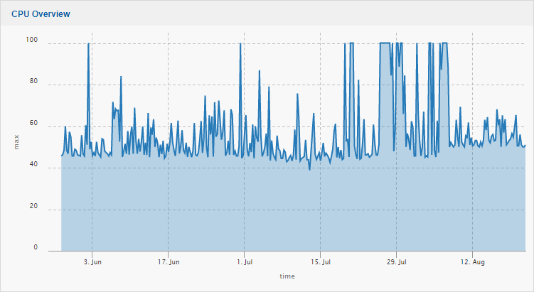 Fig 1: Workhorse Style Server
Fig 1 shows a ‘workhorse’ server. It is always on, always running 24×7. Its application demands rarely let it drop below 40%. Its an important server, but spikes are showing hot standby change to a resilient partner, which shares the load. This server can therefore go down and not impact service.
Conversely, Fig 2 shows a mission critical server, with high spec and tuning included. This server is one of many which delivers high updating market data to end users. So common is this view, we have provided it a name – ‘the hands’.
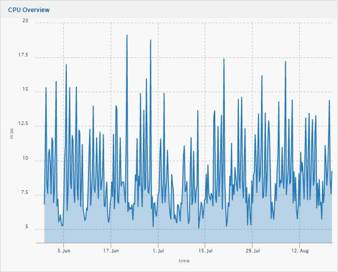
Fig 2: The Hands Style Server
Every day, many capital markets servers like this one are only active in market hours. During the period of market close, the servers are effectively dormant, simply handling the running applications and processes – no data coming in and no users connected.
 At market open however, the server explodes into life. Users login and regional market data starts to surge into the environment. During market hours there are notable peaks, such as market open in other regions, with new sets of data. Economic events, market swing and volatility all have impact. However when the markets close, the system returns to a stable, process only environment.
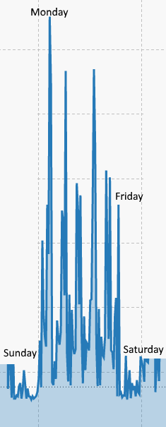
The name coined for this type of CPU visualization, ‘the hands’, comes from the dormant, non-market hours (evenings and weekends) that make Monday to Friday stand out, giving the appearance of a hand.
It should be noted as well, this is not just a CPU specific phenomenon. The visualizations of ‘workhorse’ and ‘the hands’ are commonly seen in network cards, backbone traffic, middleware messaging systems and importantly, application specific data, such as market data update, image and item rates.
To capacity trendline these servers accurately, two key elements must be place; granularity and historical data.
Granularity
The lack of granularity has been a frustration of capital markets engineers for years. Market openings, volatility and economic events can create sudden, unprecedented spikes in a millisecond. We have seen firms make the mistake of not recording full granularity, for long term periods for bandwidth analysis or ‘averaging’ out the analysis over a minute or second. And we have seen notable outages as a result.
The more accurate data which can go into a complex formula, the more accurate the end calculation. MosaicOA is built on a powerful timeseries database, InfluxDB, that can easily handle hundreds of thousands of data points per second.
Historical Data
Historical data can be a double-edged sword. Its vital to have the historical data to make effective analysis, however volatility from market swing events can skew the results. Yet you cannot remove events you may need to reference in future. IT analysts need the ability to adjust start dates and ignore outliers to achieve accurate results.
Human Led Trendlining
Good data analytics starts with human led investigation of the data. For a ‘workhorse’ server, general analysis has frequently demonstrated that despite explainable spikes, utilization increases as server OS, patches, virus and application complexity advances. If the server constantly active, with a consistent base usage, trendlines do not dramatically change – however granularity can impact results:
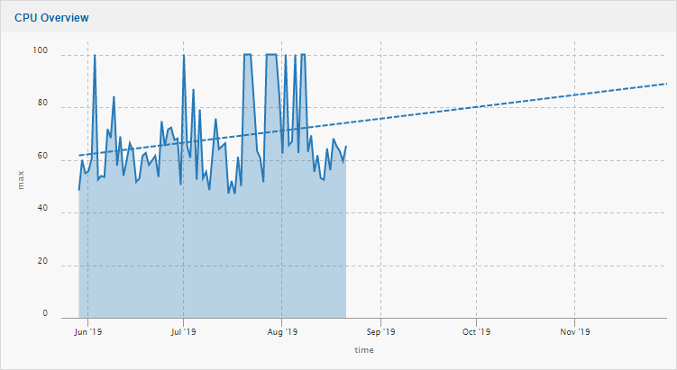
Fig 4: Trendline shows CPU will be at 89% in 100 days
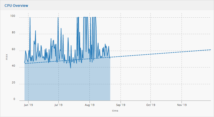
Fig 5: Increased Granularity Trendline shows CPU will be at 61.5% in 100 days
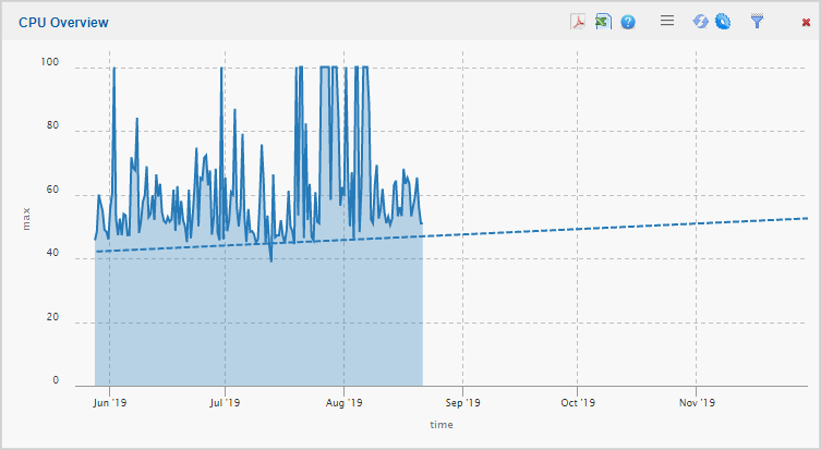 Fig 6: Final Human Led Granularity shows CPU will be At 52.3 in 100 days
As demonstrated is Figs 4-6, the more data going into the trendline, the more accurate it becomes.
The commonly found market hours or ‘the hands’ type visualization creates a wealth of distractions for an IT analytics solution. MosaicOA was created by capital markets developers and engineers from the ground up to combat these challenges and to ensure analytics are accurate. In Fig 7, we look at an application created visualization.
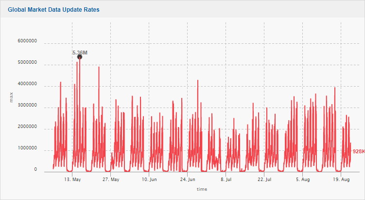 Fig 7: Market Data Update Rates – clearly showing the days, weekends and public holidays
Application statistics are a key capacity indicator. CPUs will have continually running processes, meaning there will always be a baseline above zero. Application statistics such as update rates will only provide data if the markets are open and users are connected. When the markets are closed, the application sits at zero; for hours and days every week. This will have notable impact on analysis. Therefore, we need to be able to ignore non-market hours. Analysis is required on how to do this. Market data updates for the site have created 150 million statistics in the database alone. We review the data in its full, most detailed granularity, which we call micro-mode.
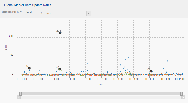 Fig 8: Micro-Mode Analysis of Non-Market Hours Behaviour
We review all regions’ specific market data behaviour, detailing market open / close times and ensure that no market activity is occurring. With these thresholds journaled, we can then set into the mosaicOA front-end what times and thresholds can be ignored from analysis.
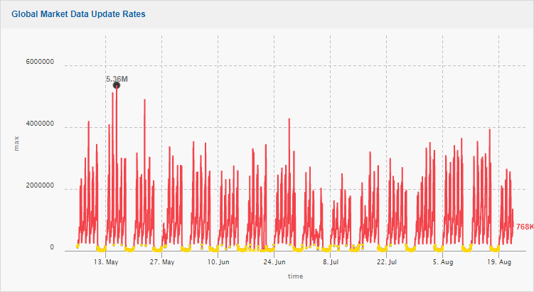
Fig 9: Non-Market Hours / Events ignored – displayed in yellow
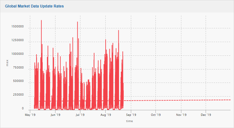
Fig 10: Trendline Without Non-Market Hours / Events Ignored – shows pattern as flat
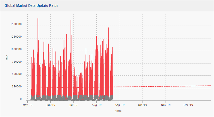 Fig 11: Trendline With Non-Market Hours / Events Ignored – shows behaviour is in fact increasing
MosaicOA can also choose to ignore peaks, such as unprecedented events, weekend testing, or even system behaviour prior to upgrades or tuning. Historical data has great advantages, but in the capital markets periods of volatility, such as Brexit, can potentially skew results.
Let’s look Figs 10 and 11 again with a start date being 2 months earlier.
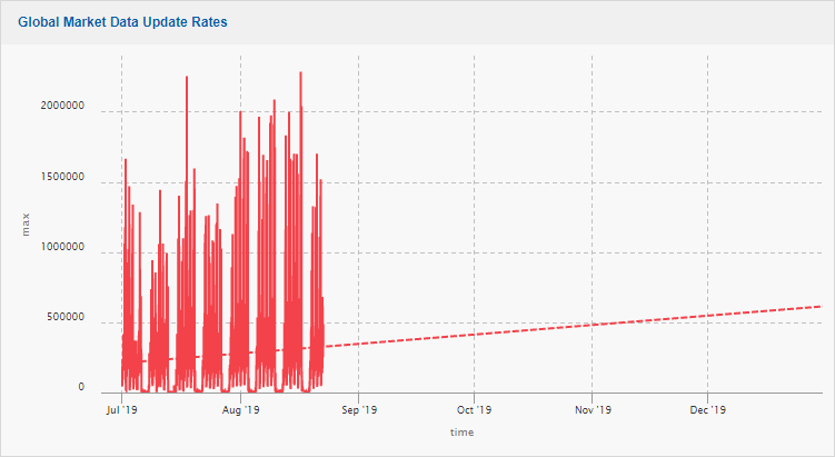
Fig 12: Change of start date to remove period of market volatility – trendline pointing upwards
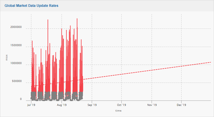 Fig 13: Market Hours removal shows the factual incline
Machine Led Analytics
A 1080p monitor has 2,073,600 pixels. As seen in Fig 13, the data being processed in the database (150million) far surpasses this. Visual interrogation and study can produce accurate statistics, but they should ideally inform strategy and analysis at the database level. We can use the rules and thresholds we have generated; however, we can now hold these against the total granularity of the timeseries database.
A variety of data processing and correlation techniques are deployed at this level. These have been informed by capital markets engineers and developers at both CJC and our global client base. Many engineers look at processes amount as an equally important barometer of system behaviour over CPU. A server’s Type (On Premise | Virtual | Cloud), Specification, OS, Patches, Uptime and location (business unit) can all be included or excluded as required. This is done via techniques such as Principle Component Analysis.
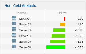
The data processing and correlation techniques are available to be customised via our mosaicOA front end GUI, these present themselves as servers being ‘hot or cold’. The system generates the results for the front end to see.
These views are integrated seamlessly into an interactive, powerful dashboard.
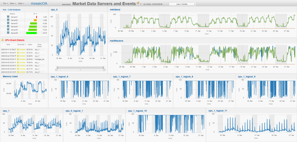 Fig 15: Final dashboard
The final dashboard is a powerful IT analytics solution – which is designed for the technology and usage of the capital markets.
Summary
Capital markets IT analysts and capacity managers need a platform that can handle the big data created by the specialist IT technology, storing it both indefinitely and economically. They also need a powerful front end that can drill down into this data and quickly interrogate and visualize. They need industry specific features to manipulate the data and inform strategy. MosaicOA, created for the capital markets by its industry engineers and developers provides the solution.
Get In Touch
Get in touch with our experts to learn how we can help you optimise
your market data ecosystem!
Arrange a Meeting