Get notified of the latest news, insights, and upcoming industry events.
A look at the importance and history of heatmaps, CJC’s capabilities, and how our IT analytics tool, mosaicOA, can uncover some vital infrastructure realities.
Steven Moreton, Global Head of Product Management, CJC
A bit of a history lesson. Although the concept of heatmaps has been used for some time, the term originated in the financial markets. Back in 1991, Cormac Kinney trademarked ‘heat map’ to describe a 2D display depicting financial market information – this software was licensed to Bloomberg, Dow Jones Telerate and Reuters for over 300,000 desktops (the trademark has since lapsed).
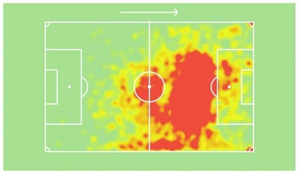
From news to weather reports to sporting events, we see heatmaps everywhere. The concept works on such a fundamental, primary level, with the eye being uncontrollably drawn to a compelling red in a field of green. Coming full circle, heatmaps are frequently used to track human eye movements in advertising.

Heatmaps – vital to the understanding of performance in many ‘fields’
In short, no visual analytics system is truly complete without a heatmap. At CJC, our IT analytics tool, mosaicOA, naturally has this in its wheelhouse – but with its capital markets history and client base, heatmaps are something, we here at CJC, take very seriously. Like all mosaic front end features, heatmaps were designed and developed with Misha Kipnis, CEO of Corellasoft and of course, the historical founder of ITRS Group.
Threshold Challenges for Capacity Heatmap
CJC provides managed services for many capital markets firms; these clients could have 20 servers or up to 4000 servers. No matter where our clients sit, there are thousands of statistics generated from hardware, networking, OS, and application components. Frequently, these components adhere to their own measurement spectrums; for example:
· CPU: 0 – 100% (with 100% being bad)
· Memory Availability: 100 – 0% (with 100% being good)
· Network Card: 0 – 204,799k (based on 25GB network card)
These differences impact thresholds; a threshold is important for defining when a green begins to turn into a red. We can’t repurpose a threshold for CPU which also applies to networking – anything over 100 will be red. Application statistics compound these differences, especially from microservices-enabled capital markets technology.
· TREP Market Data Update Rates* – 0 – 2.5 million per second
· Solace Client Messages – 0 – 95 billion
· Microsecond Latency 0 – X million
*average ADS usage in many capital markets firms. Benchmarked up to 75 million.
Adding to the complexity, as you move around a client infrastructure from a business unit or global perspective, varying levels of usage and scale become factors. This could be a Fixed Income team using their infrastructure more than equities or a US bank having a smaller infrastructure in EMEA or APAC than they do in the AMERS region.
Another element to be considered is ‘license’ thresholds. This could be an agreed/purchased number of users or total market data instruments – these can vary around a site. We must also consider exclusion periods such as ‘out of market hours’ in the evenings and weekends; numbers generated during these times could be due to testing or power-downs.
Threshold Analysis
mosaicOA provides accurate and long-term visualizations to view of all system behaviour from baseline CPU to advanced application-level statistics. The InfluxDB time-series database will chart the entire lifespan of a server’s baseline or application behaviour:


By viewing this data in this manner, you can define what thresholds servers and applications require with confidence.
Building the Heatmap
All IT metrics created by infrastructure are stored to the powerful, time-series database, InfluxDB. The data is stored indefinitely, albeit with some granularity reductions added over a 6-month period. The spectrum of time set to the heatmap is an important factor as this could be the last second to the last year, providing different heatmap results.
The heatmap function is requested via a drop-down in the front end. Users can simply place into the heatmap a query of what servers, components, or application elements need to be visualized. To keep it simple – let’s focus on some baseline server elements:
· CPU Percent Utilisation
· Memory Available Percent
· Network Packet Send
· Network Packet Receive
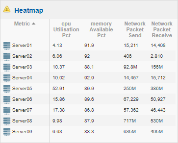
Using mosaicOA, we can very quickly request the system and elements into the heatmap view:

Raw Heatmap – no warning
The front end allows you to format the heatmap as you wish – you can have the servers along the horizontal or vertical as preferred. It is then just a matter of setting the predefined thresholds.
Apply the Rainbow
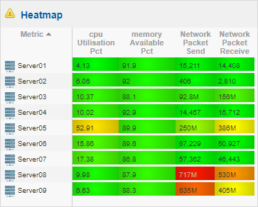
mosaicOA can set ‘warning levels’ to affect the colour of the heatmap based on the results the system produces. For each server, a variety of warning or error levels can be added – each one custom for that specific server element.
For example:

The amount of warning level thresholds can be indefinite – mosaicOA can ‘apply the rainbow’ to these limits. Here, we associate a temperature colour equal to how the numbers increment, which is correlated to the warning levels.
For a CPU – this could be:
· Warning Limit 1: Green 0-65%
· Warning Limit 2: Amber 66-80%
· Warning Limit 3: Red 81-99%
· Warning Limit 4: Black 100%
mosaicOA will then pull the information from the time-series database. This can show the system as it stands or goes back to any historical time period – the last minute or the last year.

The better the understanding of the system from the threshold analysis, the better the heatmap becomes. Infrastructure can be split up into separate heatmaps, so infrastructure belonging to specific network layers, technology types, operating systems, or business groups can be treated on its own terms. However, Senior IT executives may require a complete holistic view; no problem for mosaic.
 Easy to use/configure with mosaicOA advancements
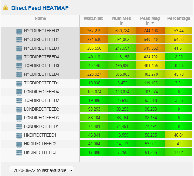
Heatmaps came in handy recently when a major vendor was having issues with their direct feeds in North America and Canada; the heatmap showed increased volatility from these feeds. This is a great example of a heatmap in action:

Level 2 Direct Feeds displayed notable heat in New York/Toronto, other regions stayed nominal
One of the greatest results of heatmaps is the ability to look at an infrastructure over a period of time and see the different peaks over a minute, hour, day, or week, helping teams to understand where systems are being utilized. Need to see the last minute, day, week, month, or year? Seeing how systems change over these periods uncovers some vital infrastructure realities.
Summary
If you don’t have a heatmap view of your infrastructure, perhaps you don’t know your infrastructure as well as you thought! Heatmaps provide a new understanding. If you would like to see this – mosaicOA is a SaaS solution and we are happy to provide short-term POC or demos over a simple site to site VPN or cross-connect. See your infrastructure for the first time with mosaicOA.
Next Up: Heatmaps for Event-Based Data
Get In Touch
Get in touch with our experts to learn how we can help you optimise
your market data ecosystem!

